Why Branding is so Important - & How to do it Right
by The Kennickell GroupWhen you start a business, there are a hundred little things you have to think about besides just what product or service you’ll offer. One of the most important things is branding, since that will be the first impression most people have of your business. But what exactly makes branding so important? And how are you supposed to know how to do it right? We’ve heard your questions, and we’ve got your answers!
What is branding?
Branding is the entire visual identity of your business. It also usually includes things like your brand’s core values, which can serve to attract customers with similar values and incentivize them to prioritize your products because of your shared values. They also serve to help give your company motivation and a reason for being that extends beyond profit. In this article though we will be focusing on visual branding, which consists of things like:
- Logo
- Color scheme
- Font group, common symbols
- Common phrases
- Photography style
- Packaging (if you sell physical products)
Why is branding so important?
Having a strong visual identity can not only attract customers, but it serves to make it easier to create repeat customers. For example, if your company sells hair care products, you want your packaging to be easily identifiable on the shelf so that your customers will never accidentally buy a competitor’s product. You want your product to be visually appealing, so that customers will enjoy seeing your product in their home. These are done through packaging, which is a combination of brand logo and brand colors.
How do you set your branding up for success?
Here are a few of the most important things you need to keep in mind when creating branding for your company.
Logo
Your logo is the most identifiable part of your branding, and that carries huge importance. To learn more about how to create an effective logo, we need to learn about logomarks vs. logotypes.
A logotype is created with the brand’s name or initials, while a logomark is a symbol or icon that represents that brand. Think of Google vs. Target. One has a logotype, one has a logomark.

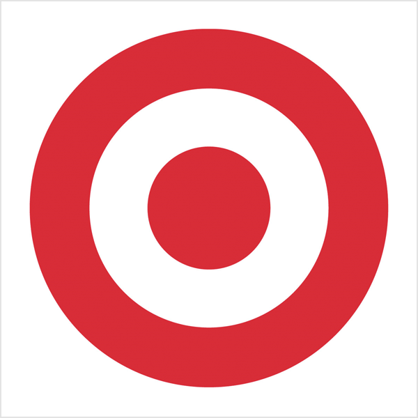
Of course, things get complicated because many logos feature both the name or initials of the company and an identifiable logomark. Our recommendation is to have a few different versions of your logo, in different colors and with and without the name attached to your logomark. This way, you have an attractive option for every type of marketing.
Packaging! Packaging! Packaging!
If your business sells physical products, the packaging of those products is likely to be your main branding outlet. According to one study, “Consumers have a first impression of sight memory for products within 0.67 seconds. The first impression dominates 67% of the purchasing process, which comes from colors.”
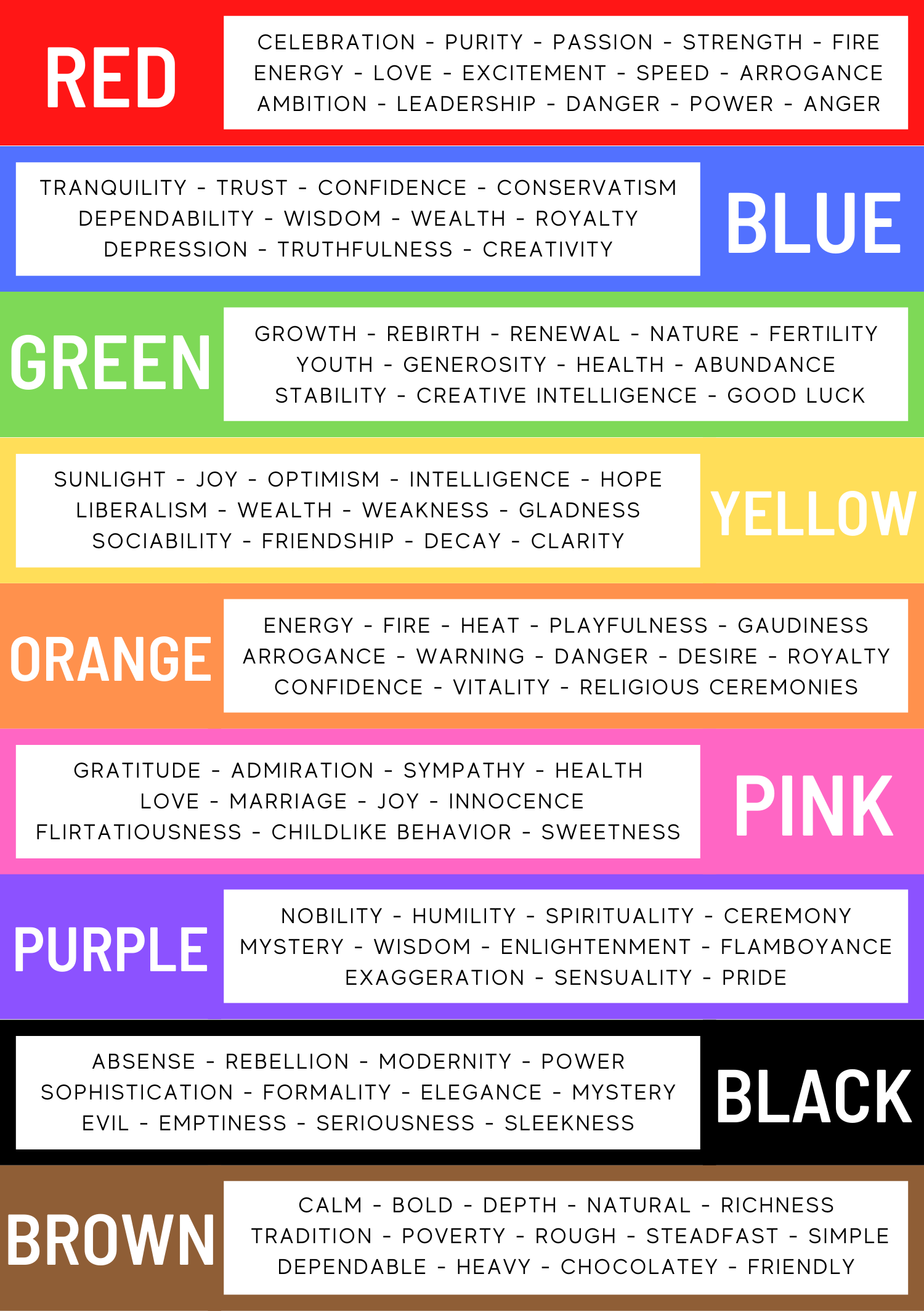
The colors on your packaging, and your brand as a whole, need to both reflect your business and be attractive to customers. Different colors have different connotations and have been shown to evoke different responses in people. Some have suggested using “activating” colors like red and blue can encourage impulse shopping. Below is a chart showing different colors and their corresponding connotations, created using information from a 2014 study on the Art of Packaging:
Consistency is Key
All of the tips in the world on how to design a brand will go to waste if you don’t have a way to consistently implement that brand. This is where a branding guide comes into play. Before you design any packaging or make a single post on social media, you should have a branding guide. It should consist of all the things we listed at the beginning of the article as being part of your visual branding, and it should be written down in a guide accessible to anyone in your company who will be creating any kind of marketing content whatsoever. Make sure you are specific in the guide as well: rather than just having a list of named colors or screenshots of colors, include the specific hexadecimal color code for the exact shade you want. Rather than just having a vague description of font families you like, include up to 4 or 5 specific fonts that can be used in different marketing materials.
You’ve got your branding…now what?
Once you’ve got your specific branding down on paper, you’re ready to start distributing that branding material and getting your business out there! You’ll want your branding on everything your company touches – and here’s where Kennickell can help. Anything you need printed, from small scale marketing materials to large scale vehicle wraps or window clings – we’ve got you covered. Get in touch today to find out how to get started!
Check out our other recent blogs:
4 Game-Changing Eco-Friendly Printing Options
Here are some of the most effective eco-friendly printing choices, from alternative paper & inks to improved printing methods.
Solving In-Store Signage for a National Retail Chain
Our client, a large national retail chain with over 1,000 stores across the United States, requires customized in-store signage solutions.
Elevating Luxury Branding for a High-End Marine Manufacturer
A premier manufacturer of marine stabilization systems needed a print partner capable of producing marketing materials that reflected the elegance and precision of their high-end products.


