5 Essential Tips for Designing a Perfect Menu That Will Help You Boost Profits
As a restaurant owner, you’re likely focused on creating the best dishes for your clientele. While having delicious food with a great presentation is a must, that’s not the only challenge. You need to have a perfectly designed menu to ensure that customers have an enjoyable experience at your restaurant. In this article, we’ll show you the best practices for designing a perfect menu.
Photos Speak A Lot
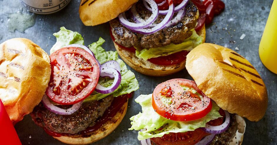
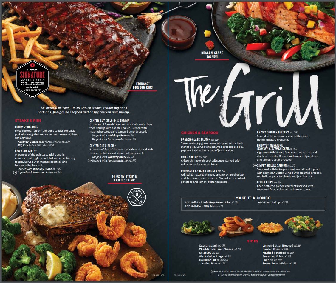
When it comes to getting clients to order specific food items, it’s best to put a photo by that menu item. It’s actually been proven that having a photo next to a menu item helps to increase its total sales by 30 percent or more. Human beings have a strong desire when it comes to seeing things over reading about them. You can use this knowledge to your advantage by having your menu printing company strategically place photos of items that return the highest profit margin for your restaurant.

Use Lengthy Descriptions
Another great menu printing technique that will be sure to increase sales is to have a long description for each menu item. An item’s description is where you make the sale. The longer the description, the more you’re drawing the customer’s eye away from the price. And, it makes them feel as if they’re getting a lot for their money.
When you have a description that uses provocative words like golden, tender, or natural, it helps to evoke hunger. Creating labels that are named after geographic locations, local brands, and so forth can also evoke interest in clients. Always remember to make the descriptions of the items with the highest profit margins longer than others. This will make the dish more desirable for patrons.
Utilize White Space Correctly
White space is a big part of any menu design. People tend to be drawn to areas of white space that is strategically placed within text or cutting multiple sections of text up. This is good news for you as you can put white space around menu items with the highest profit margin. This will make them quickly stand out and boost the odds that a customer chooses the high margin item over others on your menu.
Use The Top Right Corner
One extremely cool technique for boosting sales of any menu item is to place it in the top right corner. This is because the human eye tends to wander to the top right corner of any page. Test it out. Look at your menu or open a book. Your eyes instinctively find their way to the top right corner. Use this prime space to profit by adding your highest profit menu items.
Use Colors Wisely
Many of us know that colors evoke different emotions. You can use this information to your advantage. The color red is well-known to stimulate someone’s appetite. Yellow is a color that draws our attention, which is why it’s commonly used in a highlighter. When it comes specifically to food, green is linked with vegetables, and blue is linked to seafood. By linking up the appropriate colors, you can help patrons easily find what they’re looking for on your menu.
Contact the Kennickell Group
Designing a perfect menu aesthetic can take time and effort. You want your menus to look great and present your restaurant well, so it’s important to take your time when choosing your printed design. Contact our team today to get your design refined and printed.


